
8 Email Design Mistakes Killing Your Conversions (And How to Fix Them)
You’ve crafted the perfect subject line. Your open rates are solid. People are clicking. But when you look at your conversion numbers, something’s off. The problem might not be your copy or your offer—it could be your email design.
Email marketing delivers an average return of $44 for every $1 spent, but bad design choices can tank those results. We’re talking about the kind of mistakes that make subscribers hit delete before they even read your message. The good news? Most of these problems are fixable once you know what to look for.
Let’s walk through eight email design mistakes that could be costing you sales, and more importantly, how to fix them.
Not Optimizing for Mobile Devices
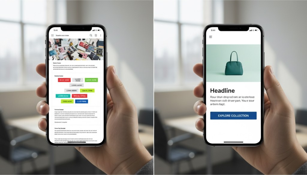
Over 50% of emails get opened on mobile devices. If your email looks like a mess on a smartphone, you’re basically telling half your audience to go away.
Here’s what happens when you skip mobile optimization: text becomes tiny and unreadable, buttons are impossible to tap, images don’t load properly, and your carefully crafted layout falls apart. People won’t zoom in and scroll around trying to decode your message. They’ll just delete it.
Mobile-first design isn’t optional anymore. Use responsive templates that automatically adjust to different screen sizes. Keep your layouts single-column so they don’t break on smaller screens. Make your buttons large enough to tap—we’re talking at least 44×44 pixels. Test your font sizes to make sure they’re readable without zooming (14-16pt for body text works well).
And don’t forget about dark mode. More people read emails in dark mode now, so make sure your design works there too. Use transparent backgrounds and avoid pure white backgrounds that look jarring when the display flips.
If you’re using email automation tools, check that your templates are mobile-responsive by default. Send test emails to yourself and open them on different devices before hitting send to your full list.
Using Image-Only Emails
Here’s a fun fact that’ll make you rethink your design strategy: 43% of people have images blocked by their email provider. If you’re sending image-only emails, nearly half your audience sees nothing but empty boxes.
Most people won’t bother unblocking images, especially on mobile. They’ll assume your email is spam or just not worth their time. Without alternate text (alt text) describing what those blocked images contain, readers have zero clue what your email is about.
The fix? Always balance text and images. A good rule of thumb is an 80:20 text-to-image ratio. This keeps you out of spam filters and makes sure your message gets across even when images are blocked.
Write descriptive alt text for every image. Not just “image1” or “logo”—actually describe what the image shows and why it matters. Use real text in your email body, not just text embedded in images. And make sure your core message and call-to-action work even if images never load.
Your visuals should support your message, not be your entire message.
Overwhelming Readers with Too Much Information
Your email is not a blog post. It’s not your website. It’s definitely not the place to dump every piece of information you’ve ever had about your product.
When you cram too much text, multiple offers, and 18 different product options into one email, you overwhelm people. They don’t know where to look or what action to take, so they take no action at all.
Every email should have one primary goal. Are you driving people to a sale? Promoting a webinar? Sharing a piece of content? Pick one and design around that. You can include 2-3 secondary messages max, but make your main point crystal clear.
Keep your copy tight. Use short paragraphs—2-3 sentences each. Break up text with subheadings so people can scan quickly. Stick to about 20 lines of text for optimal click-through rates. Use bullet points when you need to list features or benefits.
If you’ve got a lot to say, link to a landing page or resource where people can dive deeper. Your email’s job is to spark interest and get the click, not to tell the entire story.
Creating Weak or Hidden Calls-to-Action
You’ve got someone’s attention. They’ve read your email. Now what? If your call-to-action (CTA) is buried at the bottom, blends into the background, or uses weak language like “Click Here,” you’re leaving money on the table.
Your CTA should stand out immediately. Use contrasting colors that pop against your background. Make buttons large and tappable. Place your primary CTA above the fold so people don’t have to scroll to find it.
The language matters too. “Click Here” tells people nothing about what happens next. “Get 20% Off Now” or “Download Your Free Guide” tells them exactly what they’re getting and creates urgency.
Avoid multiple competing CTAs. When you give people five different things to click, they often choose none of them. One clear, compelling CTA converts better than a handful of mediocre ones.
Test your CTA placement too. Sometimes a CTA works better at the top of the email. Sometimes it works better after you’ve made your case. A/B testing will tell you what your specific audience prefers.
Using Inconsistent or Unprofessional Design Elements
Nothing kills trust faster than an email that looks like it was thrown together in five minutes. Poor quality images, spelling mistakes, broken layouts, and clashing colors all signal “amateur hour” to your subscribers.
Professionalism matters. People make snap judgments about whether to trust your brand based on how your emails look. If your design is sloppy, they’ll assume your products or services are too.
Stick to 3-4 colors max from your brand palette. More than that starts to look chaotic. Use the same fonts you use on your website—typically one for headers and one for body text. Sans serif fonts like Arial, Helvetica, or Verdana are easier to read on screens than serif fonts.
Make sure your images are high quality and properly sized. Blurry or pixelated images make you look unprofessional. Use original photos when possible—stock photos make you look generic and dilute your brand personality.
Proofread everything. Then proofread again. Have someone else on your team check it too. A fresh set of eyes catches mistakes you might miss. Test all your links to make sure they work and go to the right pages.
Your branding should be consistent across every email. Use your logo, your colors, your voice. When people see your email, they should immediately recognize it’s from you.
Ignoring Email Accessibility
Accessibility isn’t just nice to have—it’s the right thing to do and it expands your potential audience. When your emails aren’t accessible, you’re excluding people who use screen readers or have other disabilities.
Start with semantic HTML. Use proper heading tags (H1, H2, H3) to create a clear hierarchy. This helps screen readers navigate your content. Write descriptive alt text for images that actually describes what’s in the image and its context.
Use sufficient color contrast between your text and background. Low contrast makes reading difficult for people with visual impairments. There are free tools online that’ll check your color contrast ratios.
Don’t rely solely on color to convey information. If you’re highlighting an important message in red, also use text or icons to indicate its importance. Make your links descriptive—”Read our guide to email marketing” instead of “Click here.”
Keep your font sizes readable. Nothing smaller than 14pt for body text. Use simple, clean layouts that don’t require complex navigation to understand.
When you design with accessibility in mind, you’re not just helping people with disabilities—you’re creating a better experience for everyone.
Failing to Test Before Sending
You’ve designed your email. It looks great on your screen. You hit send to 10,000 people. Then you open it on your phone and realize the layout is broken, there’s a typo in the headline, and your main CTA link goes to the wrong page.
That’s the nightmare scenario, and it’s completely avoidable. Always send test emails before launching your campaign. Send them to yourself and a few team members. Open them on different devices—iPhone, Android, desktop, tablet.
Check that all your links work and go to the correct pages. Verify that images load properly. Look for typos and formatting issues. Make sure your email renders correctly in different email clients like Gmail, Outlook, Apple Mail, and Yahoo.
Many email marketing platforms offer preview features that show how your email will look across different clients and devices. Use them. Better to catch a problem in testing than after you’ve sent it to your entire list.
Test different subject lines and send times too through A/B testing. Send Version A to half your list and Version B to the other half. Track which performs better. Data and analytics will tell you what resonates with your audience.
Testing isn’t glamorous, but it’s the difference between amateur and professional email marketing.
Neglecting the Preheader Text
Most people focus on the subject line and forget about the preheader text—that little snippet of text that appears next to or below the subject line in most inboxes. This is prime real estate, and if you’re not using it strategically, you’re missing out.
Many email platforms auto-populate the preheader with whatever text comes first in your email. This often ends up being something useless like “View this email in your browser” or “Having trouble viewing this email?” What a waste.
Your preheader should complement your subject line and provide additional context that entices people to open. Think of it as your second chance to grab attention. Mobile devices show fewer characters, so keep it concise—around 40-50 characters works best.
Use the preheader to expand on your subject line. If your subject line says “Your exclusive offer inside,” your preheader could add “Save 25% on all plans this week only.” Create curiosity or urgency. Give people a compelling reason to open.
Test different preheader variations to see what drives better open rates. Just like subject lines, different audiences respond to different messaging.
Not Segmenting Your Email List
Sending the same email to everyone on your list is like serving the same meal to vegetarians and meat-eaters and expecting everyone to be happy. It doesn’t work.
When you don’t segment, active buyers get messages meant for cold leads. Long-term customers receive introductory offers for products they already own. People who abandoned their cart get the same generic newsletter as loyal advocates.
This lack of personalization tanks your conversion rates. People want relevant content that speaks to where they are in their journey with your brand.
Segment based on behavior—what people have clicked, what they’ve purchased, how engaged they are. Segment by demographics if that’s relevant to your business. Segment by stage in the customer journey—new subscribers need different messages than repeat customers.
Personalization goes beyond just using someone’s first name. It’s about sending the right message to the right person at the right time. When you nail this through proper segmentation, your conversion rates will climb.
Most email platforms make segmentation easy. Set up tags based on actions people take. Create automated workflows that move people between segments automatically. The setup takes time, but the payoff is worth it.
Conclusion
Email design mistakes are costing you conversions right now. But here’s the good news—every single one of these problems is fixable.
Start by auditing your recent emails. Are they mobile-friendly? Do they have a clear, compelling CTA? Is your design clean and professional? Are you testing before you send?
You don’t have to fix everything at once. Pick one or two areas to improve and make those changes in your next campaign. Test the results. Then move on to the next improvement.
Remember that email design isn’t about making something pretty—it’s about removing friction between your subscriber and the action you want them to take. Every design choice should either move people closer to conversion or get out of the way.
When your emails are optimized for mobile, focused on one clear goal, visually clean, and properly tested, your conversion rates will reflect it. Small design improvements often lead to big performance gains.
Stop leaving money on the table. Take a hard look at your email design and make the changes that’ll turn those opens into actual conversions. Your bottom line will thank you.
FAQs
What’s the most common email design mistake that hurts conversions?
Not optimizing for mobile devices is probably the biggest mistake. With over half of emails opened on smartphones, if your email doesn’t look good and function properly on mobile, you’re losing a huge chunk of potential conversions. This means broken layouts, tiny text, and CTAs that are impossible to tap all send people away before they can convert.
How many CTAs should I include in a marketing email?
Stick to one primary CTA per email. You can include 2-3 secondary calls-to-action if absolutely needed, but more than that confuses readers and dilutes your message. When people face too many choices, they often choose none of them. Focus on one clear action you want people to take and design your entire email around that goal.
What’s the ideal text-to-image ratio for email design?
Aim for an 80:20 text-to-image ratio. This balance keeps your emails out of spam filters and makes sure your message comes through even when images are blocked (which happens for about 43% of recipients). Your core message and CTA should work with text alone, while images support and enhance the content.
How can I test if my email design will work across different email clients?
Send test emails to yourself and team members using different email clients—Gmail, Outlook, Apple Mail, Yahoo, etc. Open them on multiple devices including smartphones, tablets, and desktops. Many email marketing platforms also offer preview tools that show how your email renders across different clients and devices. Always test before sending to your full list.
Why does my email have good open rates but poor conversion rates?
Good open rates but poor conversions usually means your email design or content isn’t delivering on the promise of your subject line. Common causes include unclear or weak CTAs, overwhelming amounts of information, poor mobile optimization, or a disconnect between what people expect when they open and what they actually see. Look at where people drop off and optimize those specific areas.