
10 Best Newsletter Signup Examples to Grow Your List

The best newsletter signup examples give shoppers a clear reason to join, ask for only the data needed right now, and trigger the next email based on what the shopper just did. For Shopify stores, the strongest signup offers are specific: 10% off first order, early access to drops, back-in-stock alerts, product education, or a quiz result they actually want.
Newsletter Signup Examples That Convert
A high-converting newsletter signup is a form, popup, landing block, or checkout opt-in that trades real value for a shopper’s email address. The best examples match the offer to buying intent, then follow with fast, relevant email: a welcome email, discount reminder, browse-based message, or product education flow.
For Shopify merchants, the signup itself is only step one. The money comes from what happens after the opt-in. A popup that collects 3,000 emails but sends one generic blast a month will usually lose to a smaller list built around behavior, product interest, and purchase timing.
Here are the patterns worth copying:
| Signup example | Best for | Typical offer | Main risk |
|—|—:|—|—|
| First-order discount popup | New visitors | 10-15% off | Discount dependency |
| Exit-intent popup | Abandoning shoppers | Save cart or free shipping | Too late on mobile |
| Quiz signup | Considered purchases | Personalized recommendation | More setup work |
| Back-in-stock signup | Out-of-stock products | Restock alert | Narrow use case |
| Giveaway signup | Fast list growth | Prize entry | Low buyer intent |
| Footer form | Brand loyalists | Updates and drops | Low conversion rate |
To make these newsletter signup examples more concrete, use the brand references below as pattern inspiration, not as a claim that the exact popup is live today. Retail experiences change often, but the list-growth mechanics are stable.
| Reference brand | Pattern to study | Why it works |
|—|—|—|
| Glossier | First-order or community signup | Clear beauty positioning and a reason to join before buying |
| Sephora | Back-in-stock and product alerts | The shopper has already shown SKU-level interest |
| Nike | Product drop and member access | Scarcity and release timing make email feel useful |
| Function of Beauty | Quiz result signup | The form gathers preference data before recommending products |
| Huckberry | Content-led newsletter signup | Editorial value gives visitors a reason to subscribe without a discount |
| Girlfriend Collective | Referral-style list growth | Existing customers can become the acquisition channel |
Email still pays off when the list is earned. Litmus found that email marketing returned $36 for every $1 spent in its 2021 State of Email report. The number isn’t magic for every store, of course. A store with weak margins, slow fulfillment, or constant couponing won’t see the same return. But for a Shopify brand with clean product-market fit, newsletter signup quality is one of the cleanest growth levers available.
Newsletter Signup Examples Checklist
A good signup form starts with the offer. “Join our newsletter” is vague. “Get 10% off your first order” is clear. “Get the winter skincare routine for dry skin” is better for a beauty brand because it tells the shopper what they’ll receive besides a coupon.

Ask for less data at the start. Email first. Maybe SMS if you have a strong SMS program. First name is fine, but only if you’ll use it. Birthday, zip code, product preferences, and gender can wait until a quiz, account page, or second email. Every extra field adds friction, and friction is expensive when the shopper hasn’t bought yet.
Use this checklist before you publish any popup:
| Check | Better choice |
|—|—|
| Offer | Specific value tied to the shopper’s next step |
| Timing | Delayed by behavior, not instant on page load |
| Fields | Email only unless extra data changes the flow |
| Button copy | “Get 10% Off” instead of “Submit” |
| Mobile layout | Thumb-friendly, easy to close |
| Follow-up | Welcome flow starts within minutes |
| Compliance | Clear consent and easy unsubscribe |
Compliance matters, too. The Federal Trade Commission’s CAN-SPAM Act compliance guide says commercial email must avoid deceptive headers, include a valid physical postal address, and provide a clear opt-out method. That doesn’t mean your popup needs a legal essay. It means the promise should be honest and the unsubscribe link should work.
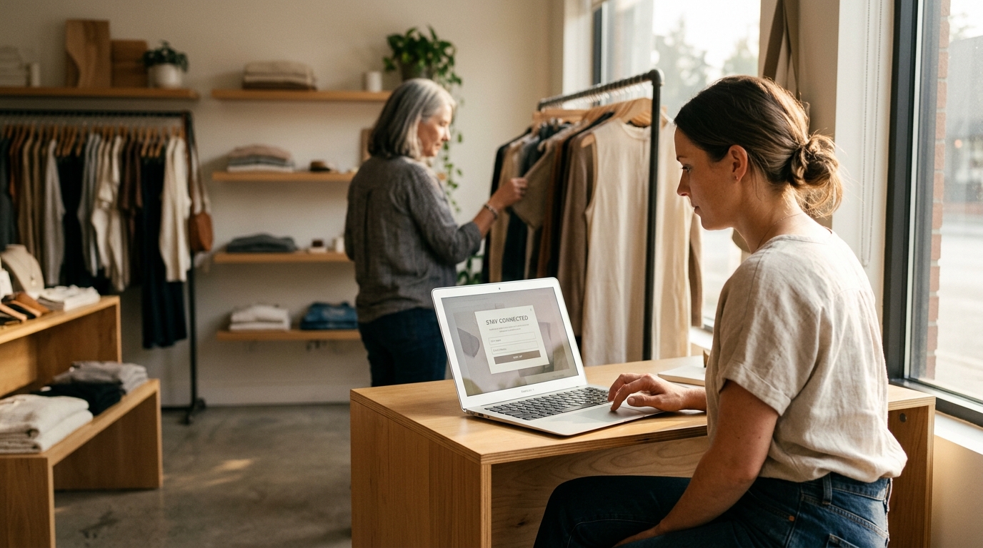
For Shopify, connect the form to events. A signup from a product page should tell your email platform which product the shopper viewed. A signup from a quiz should pass the quiz result. A signup from checkout should mark higher buying intent than a blog signup. FosterFlow was built around this idea: native Shopify events should shape segmentation and flows without a developer wiring up custom code.
1. First-Order Discount Popup
A first-order discount popup is the most copied signup pattern because it works fast. A new shopper lands on your store, looks at a product, and sees a clear trade: enter your email and get 10% off the first purchase. No mystery. No long pitch.

The best version doesn’t appear the second the homepage loads. Give the shopper a moment to understand the brand. Try 8-15 seconds on desktop, 20-30 seconds on blog pages, or a scroll trigger after the shopper has shown interest. On product pages, timing can be shorter because intent is stronger.
Example copy:
| Element | Example |
|—|—|
| Headline | “Take 10% off your first order” |
| Body | “Join the list for your code, new drops, and restock alerts.” |
| Field | Email address |
| Button | “Get My Code” |
| Fine print | “You can unsubscribe anytime.” |
This works best for stores with healthy margins. If your gross margin is 35% and you offer 20% off plus free shipping, the math can get ugly. A better option is tiered value: 10% off, free sample, or free shipping over $75. Beauty, apparel, home goods, and accessories can often use this pattern well. Low-margin electronics stores should be more careful.
The follow-up matters more than the popup. Send the code immediately, then remind the shopper once if they don’t buy. If they browse a product after signing up, don’t keep sending generic coupon emails. Use product interest. A shopper who viewed a linen duvet cover should get bedding content, not a storewide “best sellers” dump.
With FosterFlow, that behavior can feed directly into shopify email campaigns and automated flows, so the signup source, viewed product, cart activity, and purchase status all shape what the shopper receives next.
2. Exit-Intent Cart Popup
Exit-intent popups are best for shoppers who are close to leaving. On desktop, the trigger is usually mouse movement toward the browser bar. On mobile, you need substitutes: back-button intent, scroll depth, time on cart, or inactivity.

Use this pattern when the shopper has seen enough to make a decision. If someone has a cart worth $118 and moves to leave, “Get 10% off” can work. If someone opened one blog post and bounced after six seconds, an exit popup feels needy.
A strong cart exit popup should reference the moment:
| Shopper behavior | Popup angle |
|—|—|
| Cart has items | “Want us to save your cart?” |
| Cart is near free shipping | “You’re $12 from free shipping” |
| Product is low stock | “Save this before it sells out” |
| Shopper viewed size guide | “Need help choosing a size?” |
The best CTA isn’t always a coupon. For fashion stores, a size-help signup can outperform a discount because it solves the hesitation. For consumables, “Get a reminder before this sells out” can feel more useful than 10% off. For high-AOV products, offer a buyer’s guide or comparison chart.
Don’t overplay urgency. “Only 2 left” must be true. “Your cart is reserved” should mean something operationally, not just copywriting theater. Shopify merchants can use inventory events, cart events, and product tags to keep this honest.
Here is a simple flow:
1. Shopper adds item to cart.
2. Shopper moves to leave.
3. Popup asks for email to save cart or claim offer.
4. Email sends within 5 minutes.
5. Follow-up changes if the shopper buys, removes the item, or views a different product.
That last point is where most stores waste revenue. They keep sending the same abandoned cart email even after the shopper bought a related item. Your email system should react to the new event.
3. Quiz Result Signup
A quiz signup works better than a plain popup when the shopper needs help choosing. Skincare, supplements, apparel fit, pet products, coffee, bedding, hair care, and baby products all fit this pattern. The email address comes at the end, right before the result.
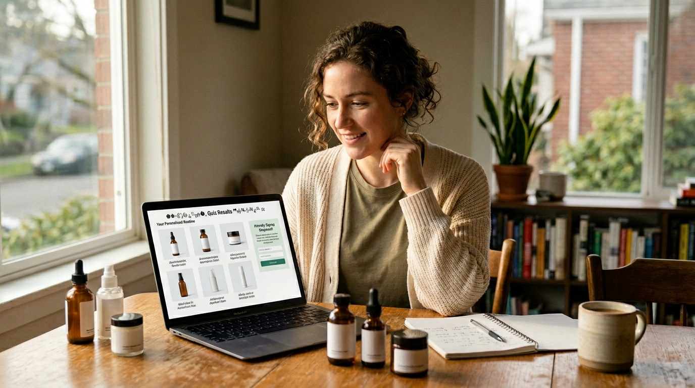
The reason is simple: the shopper has invested effort. They answered 5-7 questions. Now they want the answer. Asking for an email at that moment feels like a fair trade, as long as the result is real and not a thin excuse to push one product.
A strong quiz might ask:
| Store type | Useful quiz questions |
|—|—|
| Skincare | Skin type, concern, sensitivity, routine length |
| Coffee | Brew method, roast preference, flavor notes |
| Apparel | Fit issue, body measurement, style preference |
| Supplements | Goal, diet limits, caffeine tolerance |
| Pet food | Pet age, size, allergies, activity level |
Keep the quiz short. Five questions is often enough. Seven is fine if each answer changes the recommendation. Twelve questions is usually too much unless the product is expensive or health-related.
The email follow-up should carry the quiz data. If a shopper gets “dry skin routine,” the first email should say exactly that. The second email can explain why those products fit dry skin. The third can handle objections: price, ingredients, reviews, shipping time, return policy.
A quiz can also segment your list better than any discount popup. Instead of “new subscriber,” you now have “dry skin, fragrance-free preference, beginner routine.” That’s useful. It lets you write emails that sound like they were meant for one buyer group, not everyone who ever typed an email into a box.
Tradeoff: quizzes need upkeep. If you discontinue a product, change bundles, or add new SKUs, update the result logic. A stale quiz is worse than no quiz because it recommends unavailable products.
4. Back-In-Stock Signup
Back-in-stock signup forms convert because they sit at a high-intent moment. The shopper wanted a specific item, size, shade, or variant. The product wasn’t available. The form offers a practical fix: “Tell me when it’s back.”

Use this on product pages where variant availability changes often. Apparel sizes, shoe sizes, cosmetics shades, seasonal goods, and limited-batch items are natural fits. It also works for B2B supplies when buyers need repeat stock.
The copy should stay plain:
| Element | Example |
|—|—|
| Product message | “Medium in Navy is out of stock” |
| Signup prompt | “Get an email when it’s back” |
| Button | “Notify Me” |
| Follow-up | “Navy Medium is back in stock” |
Don’t mix this with a generic newsletter opt-in unless consent is clear. A shopper who asks for a restock alert may not expect weekly campaigns. The clean approach is to give a restock alert checkbox and a separate newsletter consent line. That protects trust and keeps your list cleaner.
The first email should go out as soon as the variant is available. Not the next morning. Not during your next batch campaign. If the shopper wanted that SKU badly enough to request an alert, speed matters.
After the restock email, use inventory-aware follow-ups. If the item sells out again, stop pushing it. If the shopper buys, stop the alert flow. If the shopper clicks but doesn’t buy, send proof: reviews, fit notes, returns policy, or a similar in-stock option.
This is one of the best newsletter signup examples for stores that don’t want to rely on discounts. The offer is not “save money.” The offer is access.
5. Product Drop Signup
Product drop signups work for brands with release energy: apparel capsules, limited-edition flavors, artist collaborations, seasonal products, and preorder launches. The form promises early notice or early access before the public drop.

The best placement is a dedicated landing section, homepage bar, or product teaser page. A popup can work, but drop signups often feel stronger when the page itself builds intent. Show the date, product name, and access terms. Don’t make shoppers guess.
Example structure:
| Page element | Strong version |
|—|—|
| Headline | “Early access opens Friday at 9 AM PT” |
| Signup promise | “Join the list for the private link” |
| CTA | “Get Early Access” |
| Follow-up | Countdown, launch link, low-stock updates |
This works best when scarcity is real. If inventory is unlimited and the product will sit around for months, don’t pretend it’s a drop. Shoppers learn quickly. Real scarcity can mean limited production, limited sizes, limited colorway, or a preorder window that closes on a fixed date.
Your email sequence should match the drop calendar. Send a confirmation right away. Send a reminder 24 hours before launch. Send the access link at launch time. Send one final note if inventory is still available. For VIP segments, use an earlier access window instead of a bigger discount.
AI send-time optimization can help here, but launch emails are different. A drop link at 9 AM PT needs to land at 9 AM PT. Use send-time optimization for reminders and follow-ups, not for the actual access email if the drop time is fixed.
The drawback is list quality after the drop. Some shoppers only came for that one product. Tag them by drop interest, then watch whether they click future releases. Don’t treat them like year-round brand fans until they show repeat engagement.
6. Content Upgrade Signup
A content upgrade is a signup offer attached to a blog post, buying guide, recipe, checklist, lookbook, or comparison page. The shopper is already reading. The form offers a useful next asset.

For example, a cookware brand can add “Get the cast iron care checklist” inside a cast iron cleaning post. A fitness apparel brand can offer “Get the race-day packing list” inside a marathon gear guide. A pet brand can offer “Get the new puppy shopping checklist” inside a puppy care article.
This pattern is slower than a discount popup, but the intent can be excellent. The shopper tells you what they care about by the page they read and the asset they request.
Good content upgrades:
| Blog topic | Signup offer |
|—|—|
| “How to Choose Running Socks” | Sock fit checklist |
| “French Press vs Pour Over” | Brew ratio chart |
| “New Puppy Guide” | Puppy shopping checklist |
| “How to Layer Necklaces” | Necklace length guide |
| “Holiday Gift Ideas” | Early gift guide access |
Bad content upgrades are generic PDFs nobody wants. “Download our newsletter” is not an offer. “Get the 7-step size guide for wide feet” is.
The email flow should continue the topic. If someone signs up from a size-guide post, send fit education, best products for that fit issue, and customer reviews mentioning fit. Don’t throw them into a generic welcome flow only. You can still introduce the brand, but do it through the problem they already raised their hand for.
This is also a strong play for search traffic. Blog visitors often aren’t ready to buy on the first visit. A useful signup offer gives them a reason to come back through email instead of disappearing into browser history.
7. Giveaway Signup
Giveaway signups can grow a list quickly, but they can also fill your account with people who only want free stuff. Use this pattern carefully. It works best when the prize filters for real buyers.

A $500 Visa gift card will attract everyone. A 6-month supply of your coffee, a stroller bundle for new parents, or a complete ski tuning kit attracts people closer to your market. The prize should make the wrong audience less interested.
A stronger giveaway form includes:
| Field | Why it helps |
|—|—|
| Email | Entry and follow-up |
| Product interest | Segmentation |
| Consent checkbox | Clear permission |
| Optional referral link | Controlled sharing |
Keep rules clear. For US promotions, prize rules can vary by state, and sweepstakes law is not the place to improvise. If the giveaway is large, work with counsel or use a promotion platform that handles official rules. The FTC also publishes endorsement guidance, and influencer or referral promotion needs clear disclosure when people are rewarded for sharing.
The follow-up sequence should separate entrants from buyers. The first email confirms entry. The second can introduce the brand through the prize category. The third can offer a runner-up code, but be cautious. If every giveaway ends with “everyone wins 20% off,” subscribers learn the pattern.
Giveaways pair well with partner brands. A matcha brand and a ceramic mug maker can share a prize bundle. A dog food brand and a pet camera brand can partner. The key is audience overlap. Two brands with similar buyer profiles and different products can share attention without competing directly.
If you use a giveaway, monitor engagement after 30 days. If a large share never opens or clicks, don’t keep mailing them forever. A big list with weak engagement can drag down deliverability.
8. Footer Newsletter Signup
Footer forms rarely produce huge signup rates, but they catch people who actively look for a way to stay connected. That makes them worth improving. A weak footer says “Subscribe to our newsletter.” A better one gives a concrete reason.

Try this:
| Weak footer copy | Better footer copy |
|—|—|
| “Subscribe” | “Get new drops and restock alerts” |
| “Join our newsletter” | “Get fit tips and early access” |
| “Sign up for updates” | “Get recipes, refills, and member offers” |
The footer signup should match the store’s ongoing email promise. If your emails are mostly product drops, say product drops. If you send recipes, say recipes. If subscribers get early sale access, say that. This is not the place for a giant popup pitch, but it still needs a reason.
Footer forms work well with preference links after signup. The confirmation email can ask what the shopper wants: new arrivals, sale alerts, education, restocks, or local events. Don’t ask all of that in the footer. Ask later, when the subscriber has already joined.
Make the footer easy to use on mobile. The input field should be large enough to tap, the button should fit, and error messages should be visible. Tiny gray text on a dark footer looks stylish until a shopper mistypes Gmail and can’t tell what happened.
This example won’t save a weak list-building strategy on its own. It is the baseline. Every Shopify store should have it because it captures intent from shoppers who don’t respond to popups.
9. Checkout Opt-In Signup
Checkout opt-ins are powerful because purchase intent is proven. The shopper is already giving you an email for order communication, and they may choose to receive marketing too. The distinction matters. Transactional email permission is not the same as marketing consent.

This signup pattern is best for post-purchase campaigns: replenishment, care instructions, review requests, cross-sells, loyalty updates, and product education. A customer who bought running shoes shouldn’t get the same welcome email as a blog subscriber. They need break-in tips, sock recommendations, return window clarity, and maybe a reminder after 300 miles.
Use checkout opt-ins to trigger customer-stage flows:
| Purchase event | Email angle |
|—|—|
| First purchase | Brand welcome and product care |
| Consumable purchase | Refill timing |
| Apparel purchase | Fit check and styling |
| Gift purchase | Gift timing and post-holiday follow-up |
| High-AOV item | Setup guide and support links |
The post-purchase signup also supports segmentation. A first-time customer, repeat customer, and VIP customer should not get the same offer. Dynamic segments should update after every Shopify event: order created, order fulfilled, refund, product viewed, customer tag changed, and more.
This is where native Shopify integration pays off. If your email app only sees a basic order sync once a day, timing gets blunt. If your email app sees events in near real time, you can stop a promo after purchase, send the right product guide after fulfillment, and avoid asking for a review before the product arrives.
The risk is over-emailing. New customers already receive order confirmation, shipping updates, delivery notes, and maybe a review request. Space marketing emails around those moments. A helpful care email two days after delivery beats a promo 20 minutes after checkout.
10. Referral Signup Popup
A referral signup popup asks existing customers or warm visitors to share the brand in exchange for credit, points, a gift, or early access. This is different from a giveaway because it relies on social trust. A friend who likes the product is doing part of the selling.

This works best after a positive moment: post-purchase thank-you page, delivery confirmation, review submission, loyalty milestone, or repeat purchase. Don’t ask a first-time visitor to refer friends before they know whether the product is any good.
Referral offers need clean math:
| Offer type | Example | Best fit |
|—|—|—|
| Give/get discount | Give $15, get $15 | Apparel, beauty, home |
| Store credit | Get $20 credit | Repeat-purchase brands |
| Free gift | Give 10%, get a sample | Beauty, food, pet |
| VIP access | Invite 3 friends | Drop-driven brands |
The signup form should capture the advocate’s email and generate a referral link. The friend’s signup experience should explain the offer in one line. If the friend needs to decode points, tiers, and exclusions, conversion drops.
Fraud control matters. People will refer themselves if the reward is rich enough. Use order history, email matching, device signals, and minimum purchase requirements. Keep terms visible without making the experience feel hostile.
A good referral flow doesn’t stop at the signup. It updates the advocate when a friend joins, when a friend buys, and when credit is available. Those emails get opened because they contain personal progress. That’s a different kind of attention from a campaign blast.
This is one of the best newsletter signup examples for stores with strong customer satisfaction and repeat purchase potential. If the product disappoints, referral mechanics won’t fix it.
Newsletter Signup Examples CTA Copy
Popup CTAs should say what the shopper gets, not what your form does. “Submit” is the worst option because it describes a task. “Get My 10% Off Code” describes a reward. “Send My Size Guide” describes the next useful thing.

Keep the CTA short, but not empty. Two to five words usually works. The surrounding headline can carry context, while the button handles action. For mobile, make the button text fit without shrinking into a cramped pill.
Here are stronger CTA options by signup type:
| Signup type | Strong CTA |
|—|—|
| Discount popup | “Get My Code” |
| Quiz result | “See My Picks” |
| Back-in-stock | “Notify Me” |
| Product drop | “Get Early Access” |
| Content upgrade | “Send the Checklist” |
| Referral | “Create My Link” |
| Cart exit | “Save My Cart” |
Avoid guilt-based close links like “No thanks, I hate saving money.” They got old years ago, and they make the brand sound less trustworthy. A simple “No thanks” is fine. If the offer is good, you don’t need to shame the shopper.
CTA copy should also match the email that follows. If the button says “Get Early Access,” the first email should confirm early access. If the button says “Send the Checklist,” the checklist should arrive immediately. Broken promise chains are one of the fastest ways to train subscribers to ignore you.
A/B test one meaningful change at a time. Test offer before button color. Test timing before font size. Test “free shipping” against “10% off” if margin is a concern. For a store with 20,000 monthly sessions, a popup offer test can reach useful directional data faster than tiny design changes.
FAQ
What is a newsletter signup example?
A newsletter signup example is a real pattern for collecting email subscribers, such as a discount popup, quiz result gate, back-in-stock alert, or footer form. The best examples offer clear value and trigger relevant follow-up email.
What signup offer works best?
For most Shopify stores, a first-order discount or free shipping offer works fastest. For higher-consideration products, a quiz result, size guide, or back-in-stock alert often attracts better subscribers.
Are popup forms bad for SEO?
Popup forms aren’t bad by default, but aggressive mobile interstitials can hurt user experience. Keep popups easy to close, delay them until intent appears, and avoid blocking the main content immediately.
How many fields should forms use?
Use one field at first: email address. Add preferences later through a quiz, welcome email, account page, or post-purchase survey when the shopper has more reason to answer.
How fast should welcome emails send?
Send the first welcome email within minutes. The shopper just asked for something, so the first email should deliver the code, guide, alert confirmation, or quiz result right away.
FosterFlow helps Shopify merchants turn these signup moments into automated email flows that react to real customer behavior. Use the form to capture intent, then let FosterFlow update segments, recommend timing, and send the next message based on each Shopify event.